
Part I - Installing Tableau
Part II - Connecting To RE and Planning our Dashboards
Part III - Our First Worksheet
Part IV - Worksheet Map
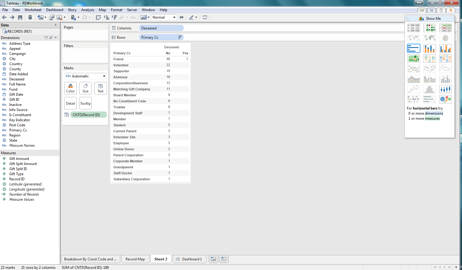
 |
| Basic worksheet showing deceased/not deceased count by constituent code |
Well, for a non-technical person have Deceased values of 0 or -1 is not very user-friendly. But these values are what is stored in The Raiser's Edge database. Tableau offers the capability to change how this is presented. I have changed these values to No or Yes, which to a "business" user is much easier to understand.
 |
| Change 0 and -1 Deceased values to No and Yes |
 |
| Adding Inactive RE dimension to the report |
 |
| Columns and Rows flipped at the click of a button |
Now that we have some data, lets begin exploring visualization. I am selecting a bar graph first. We are then able to quickly see, based on the length of the bars which constituent codes are Active/Inactive and Deceased/Not Deceased.
 |
| Bar graph for the count of records per constituent code that are Active/Deceased |
Next lets use a Treemap. This is another way to quickly see how the various counts for each constituent code, deceased, and inactive combination relates to the total. This makes it easy to see not only which combinations have the highest counts, but the proportion against the total number of records. Pretty cool.
 |
| Treemap for the demographic data |
After considering these first two options, I decided to go back to the bar graph. I thought it might be useful to add some color so that I can see what the Information Source for the preferred address for each of the combinations of demographics in the bar graph. I can quickly see that most of my constituents don't have an Information Source recorded. This would be concerning to me as I likely want to be able to see where our constituents are coming from and how we are acquiring this information so that I can identify how trustworthy that information may be. Pretty impactful and pretty easy to do as well.
 |
| Bar Graph now with color coding for Information Source for preferred address |
In this series we focused on giving Tableau a test drive on reporting against some Raiser's Edge data. I focused on demographic data for our records (constituents and relationships). What I found was how easy it was to use the Tableau Desktop software to build worksheets and dashboards from a quick test drive.
In order for someone to use Tableau it would like require a pretty technical resource that can build some backend tools such as database views, to allow for the dynamic reporting that your organization may require. But once that is in place, developing the actual worksheets and dashboards was pretty intuitive. A savvy person could come up to speed with the basic ins and outs of Tableau in a day or two. All in all, I think Tableau could be valuable for the non-profit community to use as a reporting tool for The Raiser's Edge.
No comments:
Post a Comment