Wednesday, December 17, 2014

The Raiser's Edge Data Profiler: Improve your RE Data Quality

So perhaps you checked out my post about data profiling.  Something that has been knocking around in my brain in conjunction with that post: I have created the beginnings of a Raiser's Edge Data Profiling tool.

When I set out  to work on this tool for The Raiser's Edge, first and foremost I thought it needs to be user-friendly; where someone without any technical skills (e.g. writing SQL), could run the application and gain valuable insights into their data.  As a result I think I have a tool that is a must for every organization to own and use.  I usually create stuff and give them away for FREE, but I think this product is so revolutionary in where it will be heading in the future that I am trying to figure out a pricing structure for it.  But at the end of the day it will be priced so that everyone can afford it, likely without any high, upfront costs as is typical for much of the software today, but perhaps a subscription model.

What makes the application compelling and worth spending money on?  Well, to my knowledge, there is no product out in the marketplace that has taken the best practices for profiling data and made it available in a product for The Raiser's Edge.  If you were to profile your data you would have to have someone with the technical expertise to use tools such as SSIS and Informatica Data Quality to create profiles that allow you to measure, evaluate, and discover data problems.  But these have problems as they don't allow for the integration with The Raiser's Edge or they are crazy expensive.  Would you rather spend tens of thousands of dollars (if not more) or likely just hundreds (pricing TBD) each year?

In addition, the application allows you to look at your data from a whole new perspective.  It is designed to allow you to view this data in such a way that you can discover where you have data issues.  For example, you may have a segment of your constituents (or profile view as it is called in the application) where the Title 1 is equal to "Mr.".  In the profile view you will see all of the different genders for this segment of constituents, including potentially any genders that are "Female" or "Unknown". Well, this is a problem that you likely want to fix.  The tool can't fix this issue, at least not yet :), but it has clearly pointed out and made visible to you where a data issue exists.

Before we get into it, lets hit some of the highlights (or goals), of what I wanted to accomplish and what the product offers:

  1. Best practices data profiling results for segments of Raiser's Edge records.  This includes reporting on the number of unique values and % unique, number of null values, % null, number of zero length strings and % of total, maximum and minimum values and string lengths,
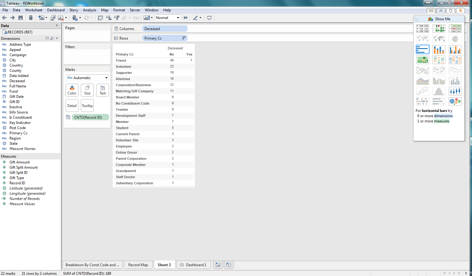
  2. Data mining capabilities to allow someone to easily mine the set of unique values (and their frequency) for a column in a segment.  For example, if I were profiling those constituents that are Board Members, perhaps I want to see the unique values for state and the number of constituents with those states within my board member segmentation.
  3. Drill-down capabilities to see the details for records that fit a specific segment.  Using my board member example above, I could then "drill-down" on those board members that live in South Carolina and see all of their details (e.g. Name, Address, constituent flags, etc.)
  4. Integration with The Raiser's Edge.  The application allows you to open The Raiser's Edge records (Constituents, Gifts, Campaigns, Actions, etc) directly from the application.
  5. No writing SQL, easy to use for non-techies!
  6. Dynamic generation of segments to profile.  For example, the application automagically creates profile views (my name for segments of records) for constituents for each of the constituent codes.   Thus pre-canned profiles are already available for all of your constituent codes, as well as many other code tables and records.
  7. Take the idea of data profiling and let it be another query engine for The Raiser's Edge, giving users another tool to gain insight into their data (beyond statistics and profiling).
  8. Ability to grow and extend the application from the first release!!!


Lets take a look at some of the screen shots for the application (currently in beta form and available for trial downloads).


At the left you will see an unassuming, clean list of segments of records within your data, aka profile views, listed on the main form.  The profile views are organized cleanly in a tree structure with folders and other organization nodes.  Out-of-the-box a wide variety of profile views are available (with more to come).  In addition, there will be new functionality added in the future allowing you (the user) to add, edit, and delete "custom" profile views of your own.  We are not quite yet sure how this will function as we want to make it as user-friendly as possible (without you having to write SQL or perform complex, techy tasks).

You can run the profile via a button on the toolbar, right-click context menu with the mouse, or just double-clicking the profile view.  Once you "run" the profile view you will then have the form loaded with the details (as seen below). The Profile View form shows the core data profiling statistics for each column in the main table (top left).  However, you have powerful capabilities, for each column to "mine the values" to see what are the different values for a column and how frequently they occur (top right table).  And finally you can then drill-down, from the list of values and their frequency, to view the details of specific records within that profile view for a specific value of a column (bottom-table).


Right-click menus are used heavily on the Profile View form seen above.  There are numerous options when right-clicking with your mouse that are not readily available on the toolbars, with buttons, for each of the tables.  For example, as seen below, right-clicking on the Constituent Address Country column for the profile view below, I can mine the values for that column in many different ways and see the results in the table at the top-right of the form. I can even refresh my profile or export the profile view results - pretty cool.


I can also right-click on the values list table and drill-down to see the records which have a specific value for a column in my profile view.  As seen in the screen-shot below, I can view the records that have a date from, in my constituent code, which is NULL.  These records would then show up in the bottom table of the Profile View form.


Once you have drilled down on records you can even right-click on a specific record in the drill-down table of the form (bottom table) and select to open the record (in its native Raiser's Edge application form no less), e.g. see Robert Hernandez's constituent RE form below.


This is only the beginning.  We have tons of ideas in our plans to continue improving this product. Go request a download and get a trial version.  Give it a whirl and provide us some feedback.  If you have any questions go to our contact page or send us an email.

Check back later and we will hopefully have more posts on the Raiser's Edge Data Profiler!

Thursday, November 27, 2014

What is Data Profiling?

Data profiling is a critical input task to any database initiative that incorporates source data from external systems or when data quality assurance for existing systems is implemented. Whether it is a completely new database build, importing a one-off file, developing an integration between systems, or simply enhancing an existing system, data profiling is a key analysis step in the overall design. Allocating sufficient time and resources to conduct a thorough data profiling assessment will help architects design a better solution and reduce project risk by quickly identifying and addressing potential data issues.

Data profiling is the statistical analysis and assessment of the quality of data values within a data set for consistency, uniqueness and logic.  The insight gained by data profiling can be used to determine whether or not the data is fit for purpose.  This may include whether or not the data is acceptable to be used for a specific purpose, imported into an existing application or database, or exported for use by another provider.

It can also be used to assess data quality via a series of metrics and determine whether or not the actual values conform to and support the intent of the metadata in the source data. Identifying inaccurate data is not an area that data profiling can measure.  However, through the exploration of data profiling results with features such as drilling-down into specific records that fit a profile, someone can make a decision that information is inaccurate. Only business rule exceptions and anomalies can be identified in the data profiling process.

Profiling tools evaluate the actual content, structure and quality of the data by exploring relationships that exist between value collections both within and across data sets. For example, by examining the frequency distribution of different values for each column in a database table, an analyst can gain insight into the type and use of each column. Cross-column analysis can be used to expose embedded value dependencies and inter-table analysis allows the analyst to discover overlapping value sets that represent relationships between entities.
  
Data profiling is best scheduled prior to system design, typically occurring during the discovery or analysis phase. The first step -- and also a critical dependency -- is to clearly identify the appropriate person to provide the source data and also serve as the “go to” resource for follow-up questions. Once you receive source data extracts, you’re ready to prepare the data for profiling. Loading data extracts into a database will allow you to freely leverage SQL to query the data while also giving you the flexibility to leverage existing profiling tools if needed.

When creating a data profile, it is best to start with basic column-level analysis such as:
  • Distinct record count and percent: Finding the number of distinct records, when compared to the total number of records, can help identify any potential unique keys within a dataset.
  • NULL count and percent: Finding the number of null, blank, or zero (for some numeric columns) can help identify any records that may not meet a minimum standard of columns or any business rule violations.
  • String analysis: Finding the minimum, maximum, and average string lengths can help identify any column-level constraint violations and help design databases to accommodate string lengths.
  • Numerical and date range analysis: Finding the minimum and maximum numerical and date values is helpful to identify the appropriate data types and identify any business rule violations.

 With the basic data profiling take care off, more advanced analysis can be implemented such as:
  • Key integrity: Checking to be sure that any unique keys don’t have zero, blank, or null values along with identifying any orphaned keys can help eliminate any key issues.
  • Cardinality: Identifying any one-to-one, one-to-many, many-to-many relationships between the data sets is important modeling and BI tool set-up.
  • Pattern, frequency distributions, and domain analysis: Pattern identification can be useful to check if data fields are formatted correctly.

Selecting the right profiling technique will depend on a project’s objectives. If you’re building a new database from scratch, take the time to execute on each of the above bullet points. If you’re simply importing a new data set into an existing database, select the most applicable tasks that apply to your source data.

Nearly all of these tasks can be conducted by writing raw SQL. The basic profiling tasks can usually be accomplished using a tool designed specifically for data profiling. Many data profiling tools have been introduced into the marketplace over the last several years to help with the data profiling process.  

If your organization wants to use data profiling to improve data quality in an existing database or help design a system integration then shoot us an email. We would love to hear from you!

UPDATE:  Our beta version of our new tool to profile data within The Raiser's Edge has been released and it can be found on the Tucamino Solutions Website.


Saturday, November 22, 2014

Data Quality - What is it and how to improve it?

Data Quality can mean many different things to many different people in different organizations and industries.  But at its core, data quality is a perception or an assessment of data's fitness to serve its purpose in a given context. 

When we think of "good" data quality, we could think of the following aspects: 
1. Accuracy – Is the information in a database accurate, e.g.  is the address of a person an accurate address for the person.
2. Completeness – Is the information complete in a database, e.g. do we have first name, last name, phone number, email, and address of a person.
3. Relevancy – Is the information relevant for the business, e.g. is it relevant to capture employee information in a fundraising database (it depends rightJ).
4. Consistency – Is the information consistent in the database or across datasources, e.g. some records have a constituent code and some do not; some applications capture first name and last name as separate fields but others as 1 field together.
5. Reliability – Is the information reliable or can I trust the information, which is really an evaluation of the first four elements, but is the most important aspect.

Within an organization, acceptable data quality is crucial to effective business processes and to the reliability of business analytics and intelligence reporting.  If you think about it, the whole point of capturing data is to then do something with it, and usually that involves making what is hopefully smart business decisions.

Data quality is affected by the way data is entered, stored and managed.  Most of the time and effort that organizations spend on data quality is usually focused on the first component: data entry.  What results is an overly controlled environment where only a few people are allowed to enter data and overly manual processes are implemented because there is a belief that this tight control will lead to “good” data quality.  Any manual process where a human has to perform a task will result in errors (this is what to be human means).  As a result an organization ends up with processes that lead to inconsistent, incomplete, and unreliable data, in addition to “hit-by-a-bus” risks.

If organizations focus more on the last element, the management of information and data, the first two components, data entry and storage, can naturally and continuously be improved, leading to acceptable data quality which improves decision making.  This last component is often times called Data Quality Assurance (DQA).  DQA is the process of verifying the reliability and effectiveness of data. 

If organizations would refocus from a data entry to a data management approach, they will end up with a more effective, efficient, and better informed organization.  More effort is spent on automating tasks, improving operations, processes, and data quality, and training and education.  Organizational awareness and intelligence are created leading to a more informed decision-making engine. 

In order to implement an improvement to data quality, several steps need to take place (which is no small task but usually a large endeavor):
1.     Organizationally a plan needs to be put in place to identify operationally what they are trying to accomplish.  This can then lead to the creation of the necessary data models to support those operations.
2.     Applications and systems need to be updated to accommodate those data models.  Focus is spent on determining the minimal set of data needed for the organization to function in its mission at maximum capacity and any unnecessary data is excluded.
3.     Data Quality Assurance is then implemented.  This includes implementing the tools necessary to measure the aspects of data quality.
4.     All processes, especially those focused on information capture and data entry, need to be aligned with organizational goals and application data models.  This usually includes the development of new software tools such as data entry forms, non-manual ETL/system integrations, and reporting and BI tools.
5.     Training and education on applications and processes need to be developed and implemented.

In summary, good data quality is an important component to an effective organization. 
Organizations need to take a step back and ask themselves if they are an organization which is focused on good data quality.  Good data quality can’t be achieved overnight but with the right focus and plan data quality can be improved over time.

If you want help improving your organization’s data quality, check us out at Tucamino Solutions or send us an email  We would love to hear about your organization, its challenges, and help you improve your data quality.

Thursday, October 23, 2014

Tableau Test Drive for Raiser's Edge Reporting - A Bit of a Deeper Dive into Demographic Reporting

In the final post in this little series, I am taking a deeper dive into reporting on other demographics using Tableau.  You can check out the other posts in this series below:

Part I - Installing Tableau
Part II - Connecting To RE and Planning our Dashboards
Part III - Our First Worksheet
Part IV - Worksheet Map

As I mention above, this post will focus on taking more demographic information from The Raiser's Edge, such as Deceased or Inactive, and exploring how we might report on this information in Tableau.  First we are creating a new worksheet.  We drag and drop the Deceased dimension into the Columns section and Primary CC (Constituent Code) into the Rows section.  Then we drag the Count of Record IDs into the table to report on the number of records.  Great, we can see which constituent codes are marked as Deceased (-1) or Not Deceased (0).  This could be valuable information if we saw that we had some key constituent code with a record marked as deceased.

Basic worksheet showing deceased/not deceased count by constituent code

Well, for a non-technical person have Deceased values of 0 or -1 is not very user-friendly.  But these values are what is stored in The Raiser's Edge database.  Tableau offers the capability to change how this is presented.  I have changed these values to No or Yes, which to a "business" user is much easier to understand.

Change 0 and -1 Deceased values to No and Yes
Now that we are reporting on the number of records marked as Deceased.  Now lets use another key bit of information to the Columns section: whether or not a record is Inactive.  This will allow us to see, for each Deceased record whether or not there are any records still marked as Active, which seems to be at odds.

Adding Inactive RE dimension to the report
As I begin thinking about visualizing the data in the worksheet I realized that I should have flipped what is in the Columns and Rows section.  Thankfully Tableau has a button that does this automatically.  Wow, that was easy and a nifty little feature.  Well, you might be saying that all good visualization tools should do that, and you would be right; but Tableau does have it so someone was  thinking about usability when they pushed for this feature.

Columns and Rows flipped at the click of a button

Now that we have some data, lets begin exploring visualization.  I am selecting a bar graph first.  We are then able to quickly see, based on the length of the bars which constituent codes are Active/Inactive and Deceased/Not Deceased.

Bar graph for the count of records per constituent code that are Active/Deceased

Next lets use a Treemap.  This is another way to quickly see how the various counts for each constituent code, deceased, and inactive combination relates to the total.  This makes it easy to see not only which combinations have the highest counts, but the proportion against the total number of records.  Pretty cool.

Treemap for the demographic data

After considering these first two options, I decided to go back to the bar graph.  I thought it might be useful to add some color so that I can see what the Information Source for the preferred address for each of the combinations of demographics in the bar graph.  I can quickly see that most of my constituents don't have an Information Source recorded.  This would be concerning to me as I likely want to be able to see where our constituents are coming from and how we are acquiring this information so that I can identify how trustworthy that information may be. Pretty impactful and pretty easy to do as well.

Bar Graph now with color coding for Information Source for preferred address

In this series we focused on giving Tableau a test drive on reporting against some Raiser's Edge data.  I focused on demographic data for our records (constituents and relationships).  What I found was how easy it was to use the Tableau Desktop software to build worksheets and dashboards from a quick test drive.

In order for someone to use Tableau it would like require a pretty technical resource that can build some backend tools such as database views, to allow for the dynamic reporting that your organization may require.  But once that is in place, developing the actual worksheets and dashboards was pretty intuitive.  A savvy person could come up to speed with the basic ins and outs of Tableau in a day or two.  All in all, I think Tableau could be valuable for the non-profit community to use as a reporting tool for The Raiser's Edge.

Wednesday, October 22, 2014

Tableau Test Drive for Raiser's Edge Reporting - Worksheet Map

This is part IV in our series of looking at Tableau as our RE reporting solution.  You can see the other posts in the links below:
Part I - Installing Tableau
Part II - Connecting To RE and Planning our Dashboards
Part III - Our First Worksheet

In this installment we will now create a map showing where our constituents are located.  The first step is to create a new worksheet in Tableau.  After doing that we selected the map "chart" type to display our data.  We have selected State as our point of departure for  map information and again the count of records.  This map already begins to tell us a pretty compelling story in a very cool way:  most of our records are on the east coast with our biggest concentration in the southeast, specifically South Carolina.  But that is no surprise for our Raiser's Edge users who log into and play around with the sample database (the source of our data for this example).

Simple map of our Raiser's Edge records and relative number per state

Now that we have our map we can do some interesting things to "spice it up" as my wife likes to say.  So I brought over the primary constituent code dimension field into the Color section and the map becomes richer.  Now we can see colors associated with each state, telling us which constituent codes exist in the state on the map and their relative numbers.  Pretty cool.

Constituent Codes now showing up in each state

After taking a look at the map, I thought the size of the circles on each state was pretty small and difficult to read.  So I adjusted the size of the circles for the number of records for each state and the map now becomes a little easier to read.

Map after adjusting the size of the circles showing the number of records

Your map could be busy and you might want to add additional filters, such as for state, or other dimension fields.  My dataset is including all of the records in RE currently (constituents and non-constituents, aka individual relationships not linked to constituents).  So I am going to add a new filter to show the results for constituents only (Is Constituent = -1).

After adding the filter, the data is adjusted to show only constituents


There we have it, now we have a map of a breakdown of our constituents, based on constituent code and where they are located.  We could make this more specific and do some dynamic stuff like selecting a constituent code to show the results for a specific segment of our constituents, based on constituent code.

Monday, October 6, 2014

Tableau Test Drive for Raiser's Edge Reporting - The First Worksheet

This is part III in our series of looking at Tableau as our RE reporting solution.  You can see the other posts in the links below:
Part I - Installing Tableau
Part II - Connecting To RE and Planning our Dashboards

Now that we are connected to The Raiser's Edge with Tableau and have a dataset to work with in our workbook, lets focus on building out some of these reports.  Lets choose to focus on the report that breaks down the number of records by their Primary Constituent Code and where they are located.

First, lets select to create a new worksheet.  Now we are presented with an environment to be able to configure our worksheet to communicate a story about our data.  We can see that we have a list of fields (dimensions and measures) by which to slice and dice our data.  We can select different types of visualizations (charts, etc.) easily with the click of a mouse.  All this can be created with a pretty slick drag-and-drop functionality embedded in the software.

Our first worksheet 's"development" environment

Now that we have our worksheet development environment ready to go, lets play around with some configurations.  So we said that we want to report on the number of records by primary constituent code.  So the first step is lets include the measure of "Record ID".  With the selection of this measure we need to be sure that we configure it to count the number of Records.  If we had selected something like summary instead our numbers would be off as it would add up the actual IDs, not count them to get a record count.  I dropped the count of Record IDs into the row section.  I want my counts to be in a vertical format, not horizontal.  If I wanted them to go from left-to-right (horizontal) I would have dropped this measure into the Columns section.

Added the count of Record IDs as my measure

As we noted in our initial goal, we want to see where these records are located.  Lets start at Country to see where we can get a breakdown of the number of records based on Country.  To do this I drag the Country column to the Columns section above our graph.  Another note is that I have selected a bar graph to represent this data.  After dropping this Country column, you can see that we have a list of 3 countries (really 2 as some records have a "null" country meaning that there is not a Country value in this field on the preferred address) where our records are located.  From this graph we can easily see that most of our records are located in the United States.  Alone, this could be valuable information if all someone cared about was the Country.

We now have Country from the preferred address added to our worksheet
We also mentioned that we wanted to see where our records are located broken down by primary constituent code.  Our view contained the primary constituent code, which is the first constituent code in the list on the Bio 2 tab of a constituent record.  We dragged our Primary CC (Constituent Code) dimension field to the rows section.  And bam, we now have, across rows, each of our constituent codes and we can see where each of the records are, per constituent code.  Really easy.


We then took it a couple more steps farther.  We added the Region dimension to the Columns section and now we can see the Country and Region for our records per primary constituent code.  Finally, I wanted to add another bit of information in a different way than column or row.  So I dragged the State dimension to the Color section.  What we are then presented with is a color coding, within the chart of our states and the corresponding number of records per primary constituent code, country, and region, as well as state now.

If we had a significant number of records, which most RE customers are going to have, and not this small sample database, this worksheet chart/graph would really come to life.  This one looks a bit empty but it conveys a heck of a lot of information and we were able to do it very easily.


Something that this chart quickly points out is that most of our records don't have a region.  If region is important then perhaps I want to duplicate the report and add state so I can begin to see which states have a null region.  This allows me to visually begin to recognize how I might need to update my data so I can accurately report on Region, but also perhaps fix a process or system integration that is populating this region column.  Maybe I need to create a new process to "automagically" populate this field in the Raiser's Edge.

We could continue to extend this worksheet in multiple ways. The view from RE pulls all records, not just constituents.  So we could add a filter to have the user select to show all records, or just constituent records.  We could also add a filter for country to only show the US or any of the other geographic dimension fields that we have.

The point is that we built a potentially powerful worksheet/chart/report in a matter of minutes and it was all really easy to do.  We can create this type of analysis on nearly any type of information in The Raiser's Edge.

Wednesday, August 27, 2014

Tableau Test Drive for Raiser's Edge Reporting - Connecting to RE and the Planning

Now that we have Tableau Desktop installed, it is time to finish some basic setup, which includes establishing a new connection to The Raiser's Edge so that we can begin actually creating our dashboards and reports.  But to establish our connection we have to do something else:  Figure out what it is we actually want to report on.

To keep it pretty simple, I decided that I would create some dashboards and reports based on basic constituent demographics; stuff like preferred address details, primary constituent code, whether they were deceased, inactive, or an individual vs. organization, etc.  Then I said,what might I want to see and I spent about 5 minutes sketching out on a plain sheet of paper some demographic dashboard components (see the image below).  I recommend that you spend more time if you were planning your own.

My rough (very rough) sketch of the dashboards I wanted

Once that I established some rough estimate of what my dashboard and reports might look like, I then had to figure out how I was going to get that information.  As most of you know, getting info from The Raiser's Edge can, at times, be a bit complex.  So I knew I wanted preferred address.  I could have chosen all addresses but figured it made sense to keep it simple and only get the preferred address.  Then I decided that I wanted constituent codes, but again I decided I only wanted the primary constituent code (the one that is at the top of the list on the records Bio 2 tab).  And finally, some information from the record itself (deceased, full_name, etc.).

Now that I established what I am pulling from the database, I then had to figure out how I was actually going to get that info.  There were several ways to do it.  I could create a view in the actual Raiser's Edge database that pulls all of that together, then in Tableau I just pull the info from the view.  I could write my own custom SQL in Tableau (which is essentially writing the same SQL for the view option above).  And finally pull in all of the tables into Tableau and try to do some fancy joining in the tool.  To be honest, based on what I am doing, I am not even sure if Tableau could have done that - but I am going to assume that it could, but I chose not to.  I went with option 1, create the database view:  it seemed the easiest to do at this time so that I could focus on the dashboards and workbooks in Tableau.

Some code of the view I created on the RE Database

So now lets create a new connection in Tableau to our view.  From the home page, select the "Connect to Data" link on the left sidebar.  Then you will see a list of native connections that Tableau supports.  You will select Microsoft SQL Server from the list connections.  This is pretty basic connection information, just as if you were connecting to the Raisers' Edge server instance that the RE database exists on via SQL Management Studio.  Enter your details and select "connect".

Connecting to SQL Server in Tableau

From there you will then select the Raiser's Edge database in the dropdown at the left.  Once you do so, all of the Raiser's Edge database tables and views, as well as stored procedures are loaded for your selection.  This may take a few minutes to load. Once loaded, you can then select the tables, views, etc. that you want by dragging them to the top box in the main part of the form.  This is where you can bring multiple tables or views over and create joins on them as I mentioned earlier if you like.  For my case, I have 1 database view already created that I selected.  I also decided to add some gift information to my view just in case I need it for other dashboards.


Connected to the Raiser's Edge and selected the view to use

Once you have selected the tables and views that you want, you can then customize the connection by changing the field names, changing the datatype, etc. in the grid at the bottom panel of the main section of the form (as seen in the screenshot below).  Once you have everything setup for the data you want to be used in your workbook, click on the "Go to Worksheet" link in the middle orange section of the form and you are ready to build your dashboards.

You can also choose to have this connection setup to use the Live data or to Extract the data into the Tableau "Fast Data Engine" which allows for offline reporting and doesn't affect the performance of your live Raiser's Edge database.  This will be an area that hopefully I can explore - pending how much time I have left in my trial.


Again, all in all, pretty straight-forward and pretty easy.  Tableau continues to be very user-friendly in terms of installation and getting setup.  I thought the real fun would start after my last post (and designing your dashboards is fun), but in the next post we will create our first worksheet/dashboard, or something:)

Other posts in our series can be found at:
Part I - Installing Tableau
Part III - Our First Worksheet

Tuesday, August 26, 2014

Tableau Test Drive for Raiser's Edge Reporting - Installing Tableau Desktop

With the advance in all of the BI and Analytics tools in the marketplace, I thought I would give one of the most popular a test drive:  Tableau.  Below are other posts in the series:
Part II - Connecting To RE and Planning our Dashboards
Part III - Our First Worksheet

Tableau has numerous offerings in their suite of products including Tableau Desktop, which appears to be the primary one you would 'develop' your dashboards and BI reports, Tableau Server and Tableau Online, which appear to be engines where your developed dashboards and reports can be published for consumption by others in your organization.

So lets see how easy it is to get started on Tableau Desktop.  The first step is going to the Tableau website and requesting a download of Tableau Desktop:  easy.  You can go to Tableau Desktop and click on the Try It Free link to start your download.

The Tableau Desktop webpage with the Try It Free link

The size of the download was only a little over 100 mb, so not too big.  Once you have downloaded the software, just go find the setup executable on your hard drive and double click on it. The Windows installer is launched and you get a rather simple wizard.  The first screen just allows you to view the License Agreement and to provide some minimal customization of the product.


After clicking the "Install' button, you get the typical "Installing" wizard form with a status label and progress bar.  It only takes a minute or two for the actual installation to take place.

Once the installer is completed, Tableau is launched and you can start your free trial, 'start trial later' (which I recommend if you know you can't start playing around with the tool immediately so you don't waste valuable days of your trial), or activate your product.


Wow, that was easy.  Installing Tableau Desktop was that easy.  Now comes the more difficult, and much more fun, part - creating BI and Analytics dashboards and reports.  So lets give it a spin and see how it performs and the cool features it may have.

When you first start your trial, Tableau was nice enough to have some sample "workbooks" which appear to be their "projects" that you create your dashboards and reports in.  I think these samples are actually pretty good.  In addition, there are valuable links to training videos that you can watch, which are pretty darn good as well.  

Sample workbook that  comes with Tableau Desktop
All in all, a pretty positive first impression from Tableau.  I did initially install on one of my laptops running Windows 8.1 and it would crash (the blue screen of death) due to various issues, mainly memory issues even though I have enough.  My Windows 7 laptop (ironically with less memory than the Windows 8.1) had no issues whatsoever.

Up next, lets plan out our first workbook and get connected to RE.


Friday, August 1, 2014

Reporting on Raiser's Edge Recurring Gifts with the RE Recurring Gift Reporter Excel Add-In. It is so easy!

Hi everyone.  Thanks again for coming to my blog.  Recently I posted about different ways to report on The Raiser's Edge.  Then I took a deeper dive into Microsoft Excel reporting.  In this edition I am going even further, focusing on one example of a pretty cool way to integrate The Raiser’s Edge with Microsoft Excel.  I am thinking that this will be one post to highlight what I did but I could see it turn into multiple posts.

Awhile back, I saw a post on some forum about how to report on recurring gifts.  This got me to thinking about one of the challenges of reporting on recurring gifts: that it is difficult to get a report of future recurring gift installments (or future revenue from recurring gifts).  At least I don’t know of a good way to get at this info right now.  And I would be willing to bet that many organizations would like to be able to see what their expected future revenues are, and particularly for future recurring gift installments.  Having this information could result in better future planning of future fundraising success.

OK, lets cut to the chase:  What did I do?   I used Visual Studio to create a Microsoft Excel Add-In which can be installed on a pc or laptop running The Raiser’s Edge and Microsoft Excel  (disclaimer versions must be compliant; e.g. this will not run on Excel 2007 as it was built for 2010 and higher;  however also note that it has not been tested with Excel 2013 yet).  This Excel Add-In hooks into The Raiser’s Edge API, prompting the user for a RE Login if they are not already logged in and then generates the raw data, along with reports and charts (if selected) automagically in Excel. 

Lets circle back around and discuss what this stuff looks like and how it behaves.   After the Add-In is installed, the next time you open Microsoft Excel 2010 you should see a new ribbon available named RE Recurring Gift Reporter. 


Once Excel opens and you navigate to the RE Recurring Gift Reporter ribbon, you are presented with several options.  Lets take a look at the View Future Recurring Gift Installments, which is really a forecasting report.  Clicking on the button reveals the following form:


As you can see it is pretty straight-forward.  But that is the point.  Keep it simple and if anyone wants more features they can easily be added to the form.  But lets take a closer look, the user can select to create pivot tables and charts or not.  If no pivot tables are selected, then just the future recurring gift installments are exported in raw data format.  In addition, the user can select an "End Date" for future installments.  As a result however far in the future you want to report on, you can.

After you click the "Create" button then what you selected will be exported into Excel, resulting in something like the worksheet below:


Again, it really is that easy!!

The second large button, View Recurring Gifts, functions just the same as the other button, but provides reports on the recurring gifts themselves, not future installments.  When those reports are run it may look like the spreadsheet below:


It is really that easy.  Open Excel, select a report to run, click the settings, (possibly log into RE), and the report is generated.  You can run it multiple times, day after day and begin to have some intelligence about your future revenues.

A few other notes about how the Add-In works:

It exports the raw data into a spreadsheet and creates a named range from which it creates reports.  You can run it to export only the raw data and you then work with the data yourself.  Or you could select it to create the pivot tables and charts, giving yourself a starting point for how to use the raw data.

In the event that your database has a large number of recurring donations and you select a very large time period to report on, it may take a while to load the data into the spreadsheet.  This could be improved and function slightly different should you need that capability. 

Only a subset of the available columns in RE are used in this Add-In.  I focused on the core ones for now.  For a reasonable fee I can customize the Add-In for your needs, including adding more columns available in the Add-In.

 It pulls gift split information, so it can report on campaign, funds, and appeals for split gifts.  In addition, the system record id for the gift is included so that you can group gift information together to report on total gift information (e.g. the total amount for the gift not just the split amount). 
     
So what you say?  I say great question, or is that really a statement.   I would turn it back around and ask you the following questions:
     1.  Can you tell me how much expected future revenue you have coming in per month from recurring gifts over the next X number of years?
     2.  Can you tell me how much money you have coming in for a specific campaign, fund, or appeal over the next X number of years?
     3.  Can you tell me how much money you have coming in for a specific primary constituency (from the constituent record) over the next x number of years?
     4.  Can you tell me how much money you have coming in for a specific fund and gift constituency (from the recurring gifts) over the next x number of years?
     5.   If you can do any of the above, how long will it take you to pull that information?

I think these are pretty great questions to ask.  We can do 1 through 4 plus produce all other kinds of reports slicing and dicing future recurring gift installments and we can do it in a matter of seconds, maybe minutes depending on how much data you have.  I think that is pretty darn awesome. 

Guess what else?  Your Executive Director, or Development Director, could get this information without having to ask their Database Manager to “produce the report and send it to me”.   It is that easy to use.  Plus you now have the data in a workable format and you can create a lot of other reports from the data presented to you.  This data is not static, like a Crystal Report would be.  You can trust the data as it is coming directly from The Raiser’s Edge (assuming that is that you require your employees to enter this information into The Raiser’s Edge).

OK – Now the sales pitch.   I know, I know, but it is necessary for me to continue providing these great tools for non-profits.  Go check it out and request a download to see for yourself.  Even better, we can customize it further to tailor it to what you need at a great rate.   We can even do something similar with other Raiser’s Edge data or  even data that exists in other databases.  Stop struggling with getting your data into a format that is difficult to use and extend, or takes forever to produce.  Reach out to us and we can tell you more about the product and discuss how easy it would be to make it even better for your needs.

Thursday, July 31, 2014

Leverage a tool most already have for RE Reporting: Microsoft Excel

In an earlier post, I laid out some options, other than Crystal Reports, of how one might report on The Raiser's Edge.  In this post I will take a deeper dive into one of those options: Microsoft Excel.

On the surface many think that Microsoft Excel is not the best reporting tool.  Some would put forth that it is great for informal,one-off, individual reporting and not for enterprise-wide consumption.   And to a certain degree they are right.  However, from a non-profit perspective where limited budgets, limited resources, and lack of technical options and even technical know-how are prevalent, Microsoft Excel can be a powerful tool.

First, lets consider why Microsoft Excel can be a great reporting tool:

1.  People know it (sorta) already - Many people are already familiar with it and can navigate through the application fairly easily.  Some of the ways that I put forth in this post about using Microsoft Excel as a reporting tool are beyond the skills of many users, but because these users are already familiar with Microsoft Excel, the navigation of the dashboards and reports that are produced are still familiar to that end-user.
2.  Good automation and integration capabilities - Microsoft has done a pretty good job of creating features that allow for easy integration with other databases, workbooks, or data sources.  Through VBA (Visual Basic for Applications), Macros, Add-Ins, SharePoint integration, and other data integration capabilities, cumbersome, time-intensive, even very difficult or impossible tasks can be accomplished at the click of a button.
3.  It travels well - When offline, a database cannot be accessed.  A website cannot be accessed.  But if that data has been placed in an Excel spreadsheet, it can go where the end-user goes.
4.  Rich interactive and drill-down ability - When the "raw-data" has been placed in a workbook, the reports, charts, and pivot tables from this data come alive, allowing an end-user to drill-down into the details from summarized dashboards.

Next lets look at the challenges of using Microsoft Excel:

1.  Technical Competencies Needed - In order to really take advantage of Microsoft Excel, it will likely require someone that has a specific technical skillset that you may not have in-house.  But that is likely true for any application that you are going to use to report on The Raiser's Edge.
2.  Stale Data -  Data can become stale and can tell a story from an obsolete point-in-time if not used with caution, or implemented dynamically.  So these Excel reports must be understood in the context of when they were created or they must be implemented in such a way that they can be updated or refreshed on-demand.
3.  Software Limitations - There are limitations on the software itself, e.g. row limits in a workbook.  In addition, the delivery of the workbooks can be challenging - email, network drive, SharePoint library, etc. all present problems because the Excel "file" could be quite large.  But again, this is where implementation and design makes a huge difference:  allow a user to be able to create the report on-demand.

Powerful features of Microsoft Excel:

1.  Get External Data - First of all, Microsoft Excel allows the end-user to connect to multiple different types of data sources and import this data into an Excel spreadsheet.  Microsoft Access, Web Services, XML Files, SQL Server, ODBC (Microsoft Query), and other sources can all have data pulled into an Excel spreadsheet, including The Raiser's Edge.  This will often require some level of technical  competency to be able to use and likely can only be used by those with those technical competencies.
2.  VBA (Visual Basic for Applications) - This is where it starts to get interesting.  An Excel Macro-Enabled Workbook (.xlsm file) can have VBA code embedded which allows for all kinds of automation procedures.  This is the first capability that can really improve efficiences and reduce the time it takes to generate a report.
3.  Add-Ins - Microsoft Visual Studio can be used to create Excel Add-Ins which allow for application level automation.  Whereas a VBA macro is related to a specific workbook (and the code goes with that workbook), an Add-In is available to all workbooks.  Think in terms of writing code that automates a task and the task is executed by a user clicking a button on the Excel ribbon (just as if someone was clicking the Sort button).
4. Pivot Tables and Charts - Pivot tables and charts are the actual implementations of "reports".  They allow for great analysis and visualization of data.  Pie-charts, line-graphs, trends, etc. can all be visualized.  In addition, these are living, breathing reports.  When a the pivot table is changed or refreshed, the chart changes with the pivot table.  Expanding and Collapsing off the analysis of the data is available - all pretty power stuff.

There are more features and maybe I will highlight them in follow up posts.

Finally, some practical examples/ideas for Microsoft Excel reporting of The Raiser's Edge:

1. KPI and metrics - Perhaps you have someone create some VBA code or an Add-In that queries a specific database and provides "results" in the form of KPIs (Key Performance Indicators) and metrics.  These KPIs can either be business-driven (e.g. sales/revenue metrics) or data quality driven (e.g. # of records missing an address).  This could then be extended to create charts and graphs showing the trend of the KPI over time.  For example, you can see how your data quality improves over time if the KPIs and metrics are recorded and saved each time the tool is run.  You can then evaluate your strategy to improve data quality to see if it is actually working.
2. Improve those manually created excel spreadsheets - Think of a situation where you have to combine  multiple spreadsheets and then do a lot of copy and pasting of data from one workbook to another.  Then you need to get a report from another database and enter that data.  It takes forever.  If you are doing the same thing over and over, every time, then let someone write some VBA code to allow this to be automated for you.  This saves from human error as well.
3. Report on future/expected revenue (recurring gifts)- Perhaps you have a situation where you want to plan future campaigns, or other revenue generating activities, and but you want to see where expected future revenue will be impacting your organization.  An add-in can be created which, at the click of a button, can connect with the database and extract this information, creating pivot tables and charts, slicing and dicing this information giving you the ability to see where this future revenue will be recorded.

Update - I have created a Microsoft Excel Add-In that does just that.  You can go to the blog post with details about the Microsoft Add-In and see more information about it and how it works.

4. Report on solicitor activity/details - Imagine you open Excel, go to a new ribbon, and click a button.  You are automatically logged into RE, and prompted to select from a list of solicitors.  Once you select the solicitor you want a report on, you get a new spreadsheet showing lots of valuable information about the performance of the solicitor:  gift summary information, action summary, proposal summary, etc.  No queries, no exports, no complicated crystal reports that doesn't give you all you want or need.  That is the beauty, you get everything you want to see!
5. Pull data from multiple databases into 1  report - Imagine you've got Raiser's Edge data, as well as data from other third party vendors, and this data has not been pulled together in one database.  You could have a report written where the data is pulled together from these disparate data sources and organized in such a way that you get the visibility across these sources.  But this also begs the question  of why aren't you pulling this data together in a data warehouse or The Raiser's Edge itself before doing the reporting?

Good luck in your use of Microsoft Excel. Let us know if we can help you out or talk you through how you might leverage Excel as a better reporting platform for your organization.